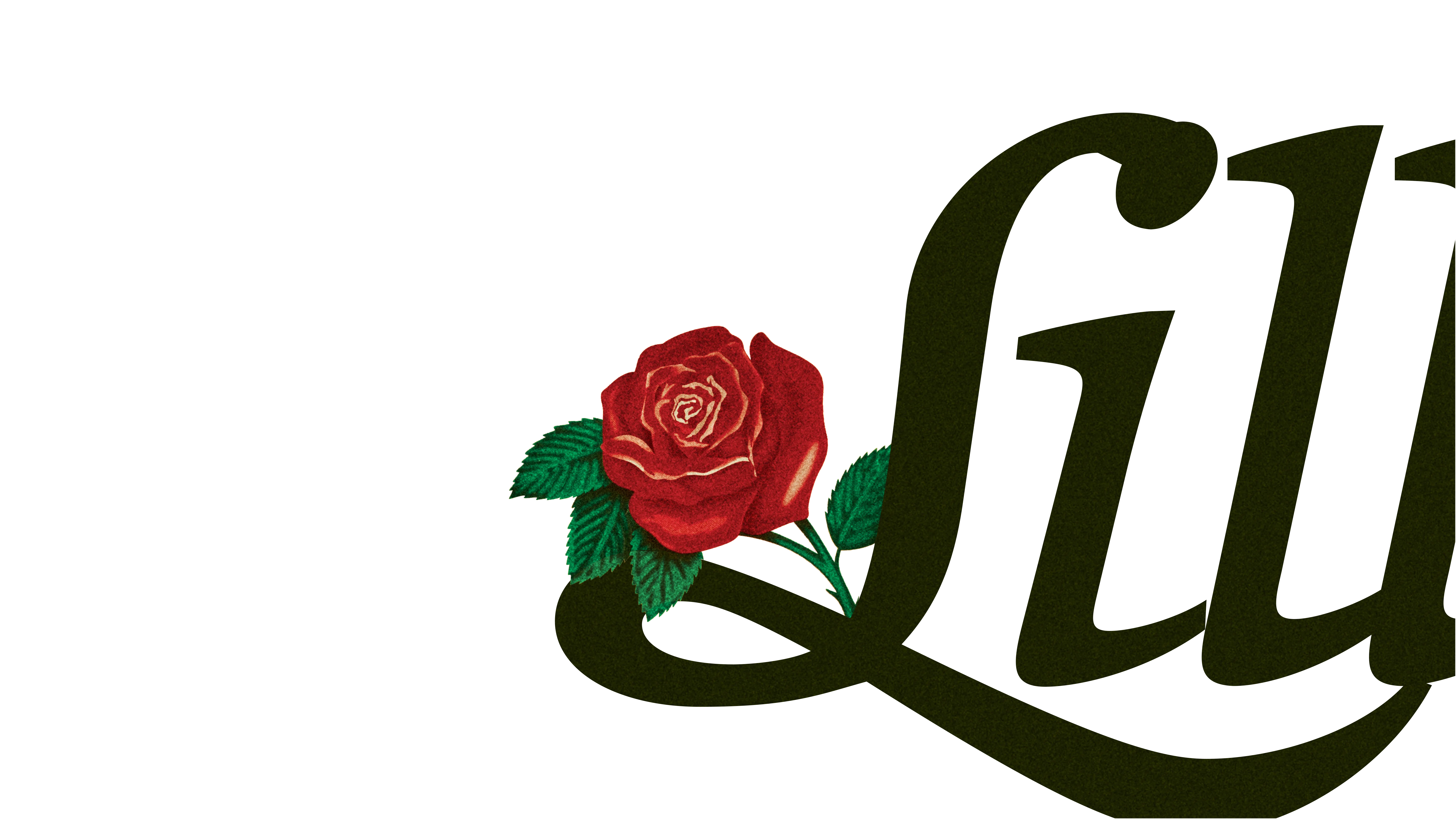
TRES FLORES - REGULAR/ITALIC
An illumination of traditionalMexican culture, contrasted with the difficulties of the hyphenated American.
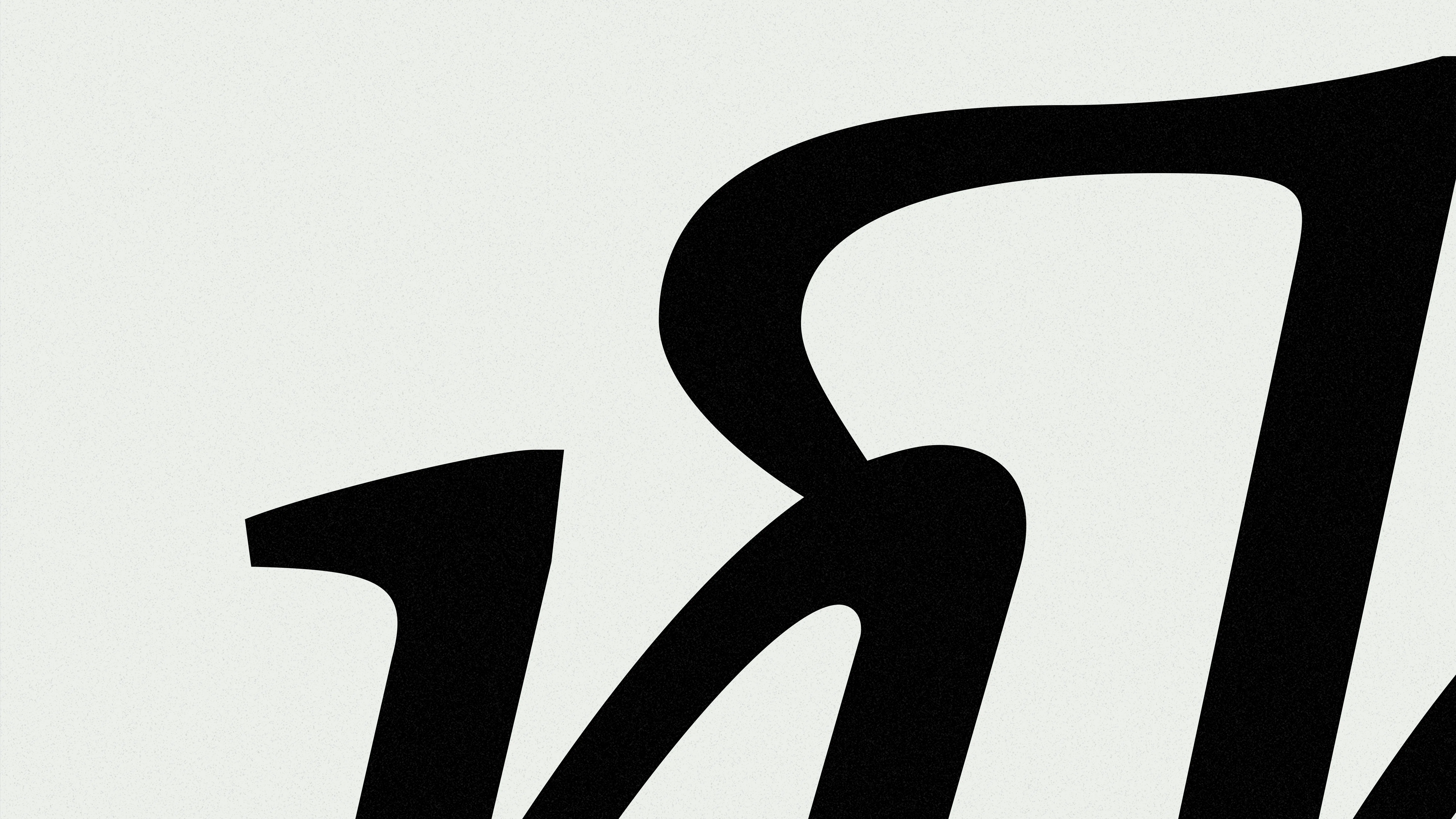
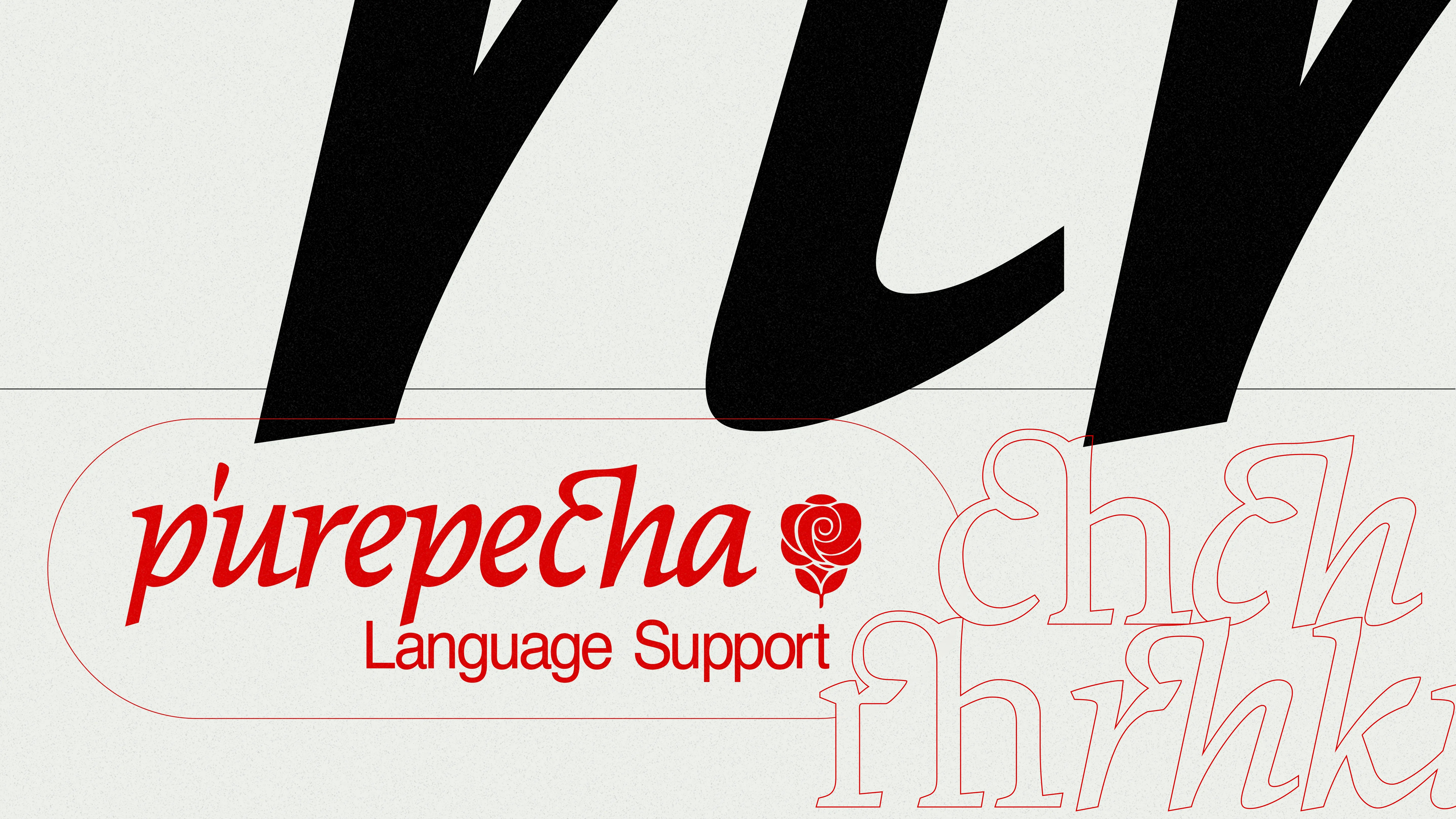
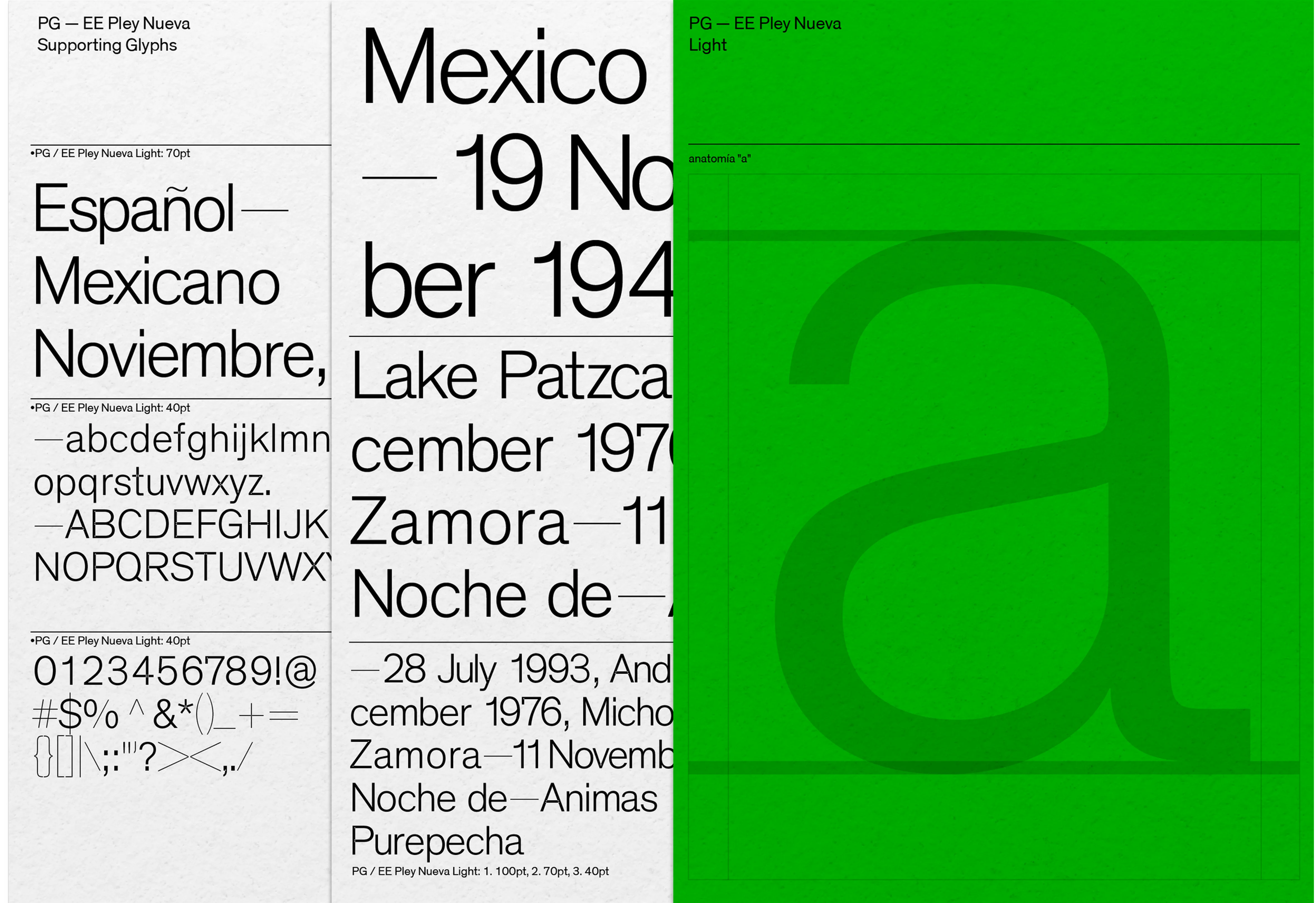
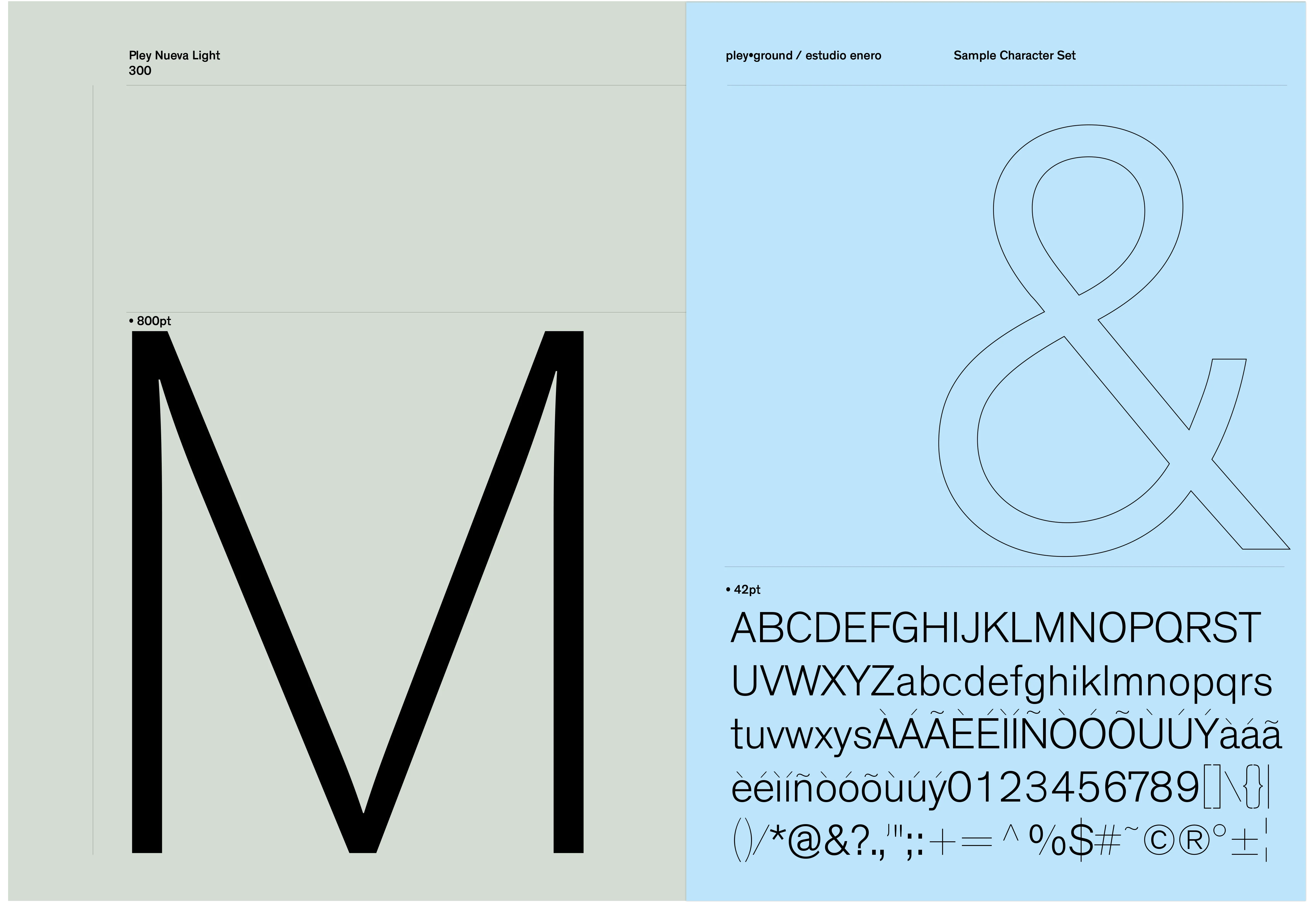
Intended to function as a legible text typeface for print, editorial and web usage, Tres Flores is a beautiful and timeless set of translation contrast letterforms bred from a set of photographs portraying multiple generations of my family who emigrated from Mexico and settled in the Central Valley of California. Tres Flores includes two styles, text and a fanciful italic in one weight. The typeface includes support for the Purepecha indigenous language, ornaments and playful alternates.